고정 헤더 영역
상세 컨텐츠
본문
728x90
미니 프로젝트 마무리 후.
파이썬 안 되던 것 킹받아서.. 한글자료여서 강의내용 대로 잘 안되나 싶어서 캐글에서 긁어 왔던 것으로 재시도 해보았다.
import pandas as pd
ufo = pd.read_table('/content/ufo-sightings-transformed 3.csv',sep=',')
ufo.head()
일단 어떤 컬럼이 있나 살폈고

위경도 자료도 있어서 지도에 찍는 실습 해봐야겠다 싶었음

ufo.info()
이것도 날짜 포맷 바꾸려는데 날짜와 요일까지는 먹혔으나 시간이 안되더라. 아주 골칫덩어리. 언젠간. 밝혀내겠다. 는 다짐
format='%Y-%m-%dT%H:%M:%S.%f'
기재가 편하도록 첫 컬럼명을 바꾸었삼.
ufo_new=ufo.rename(columns={'Unnamed: 0': 'id'})#시간대별 관측치
hours= ufo_new.groupby('Hour')['id'].count()
hours
#월별 관측치
months=ufo_new.groupby('Month')['id'].count()
months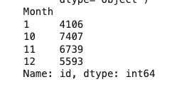
#계절별 관측치
seasons=ufo_new.groupby('Season')['id'].count()
seasons
시각화

#그래프 사이즈
plt.figure(figsize=(10,5))

#그래프 x축 y축
plt.bar(hours.index, hours)

#그래프 x축 레이블
plt.xlabel('hour')

#그래프 y축 레이블
plt.ylabel('observations')

#x축 눈금 표시 하기
plt.xticks(np.arange(24))

#그래프 출력
plt.show()
양 옆 공백 없애고 싶은데 아직 그런 재주는 없다. 그래도 x축 눈금은 적절히 설정해야함을 배웠다 자동으로 안나오드라
#그래프 사이즈
plt.figure(figsize=(10,5))

#그래프 x축 y축
plt.bar(months.index, months)

#그래프 x축 레이블
plt.xlabel('months')

#그래프 y축 레이블
plt.ylabel('observations')

#x축 레이블을 90도로 변환
plt.xticks(rotation=90)

#x축 눈금 표시 하기
plt.xticks(np.arange(13))

#그래프 출력
plt.show()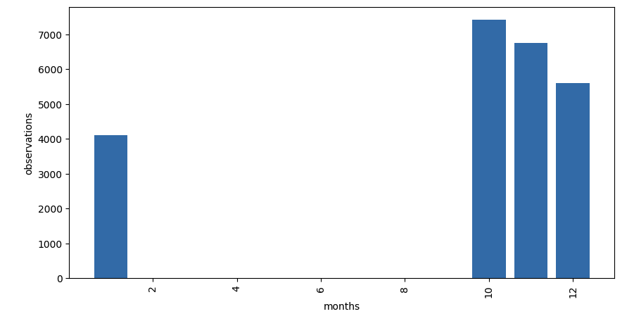
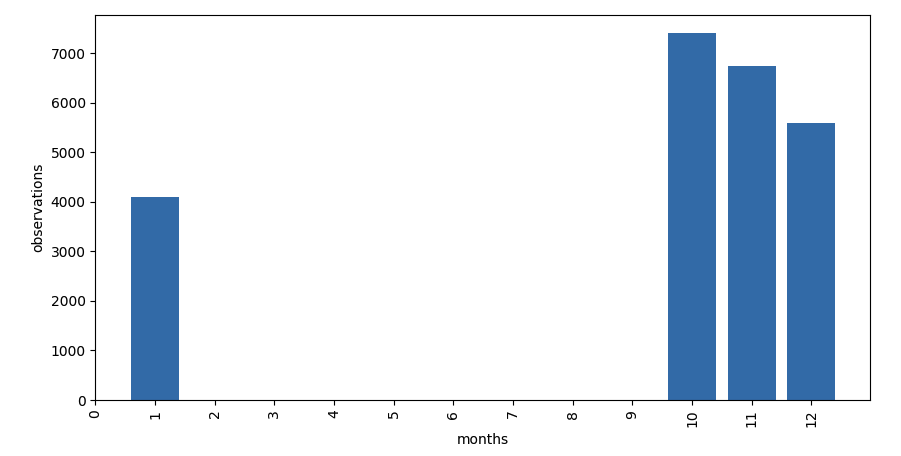
월별. 위에 말했듯 x축 눈금 간격 표기의 중요성, 비포 애프터이다.
이 또한 양 옆 공백 없애고 싶다만..
계절 시각화는 사실 월별과 차이가 없으니 그냥 안했다.
대망의 지도찍기(?
import folium
from folium.plugins import MarkerCluster

ufo_new.dropna()

m = folium.Map(location=[29.883056,-97.941111],
               zoom_start=11)
m
짜잔. 아마 미국.
그래서 이제 위치별로 관측된 횟수를 도형으로 나타내자.
for n in ufo_new.index:
  radius = ufo_new.loc[n,'id']

folium.CircleMarker([ufo_new['latitude'][n],ufo_new['longitude'][n]],
                        radius = radius/50, fill=True).add_to(m)
일단 위경도 중심점을 어디로 해야 하나 해서 그냥 첫번째 행값으로 대치했다.
ValueError: Location values cannot contain NaNs.
짜잔 오류.
글서 결측값 확인해봄

저 밑에 True 로 기재된 것이 결측값이라고 함.
ufo_new.dropna()제거 시도.
근데도 오류.
튜터님에게 질문.
답변. --> 저 라이브러리는 위경도가 같은 지역 몇 군데를 지도에 원으로 표기하는 것.
지금 작업하는 자료는 위경도가 모두 다름. 그래서 적합하지 않은 방식인 것임.
글서 튜터님이 다른 사례에서 사용한 라이브러리를 보내주심
https://www.kaggle.com/code/everydaycodings/data-analysis-on-ufo-sightings
Data Analysis on UFO Sightings
Explore and run machine learning code with Kaggle Notebooks | Using data from UFO Sightings
www.kaggle.com
import warnings
warnings.filterwarnings("ignore")

%matplotlib inline

import pandas as pd
warnings 뭔지 모르겠으나 일단 시키는대로 하고..
data.dropna(inplace=True)
data['Date_time'] = pd.to_datetime(data['Date_time'])
data.drop(columns=["Unnamed: 0"], inplace=True)
data.head(1)
요래 결측값을 제거하고. datetime 사용. 이름 없는 첫 행 삭제.
# Set Seaborn style and color palette
sns.set(style="whitegrid", palette="viridis")

# Extract and analyze the distribution of sightings over different years, months, and hours
yearly_counts = data['Year'].value_counts().sort_index()
monthly_counts = data['Month'].value_counts().sort_index()
hourly_counts = data['Hour'].value_counts().sort_index()

# Plot the temporal distributions using Seaborn with rotated x-axis labels
fig, axes = plt.subplots(3, 1, figsize=(15, 12))

sns.barplot(x=yearly_counts.index, y=yearly_counts.values, ax=axes[0])
axes[0].set_title('Yearly Distribution of Sightings')
axes[0].set_ylabel('Number of Sightings')

sns.barplot(x=monthly_counts.index, y=monthly_counts.values, ax=axes[1])
axes[1].set_title('Monthly Distribution of Sightings')
axes[1].set_ylabel('Number of Sightings')

sns.barplot(x=hourly_counts.index, y=hourly_counts.values, ax=axes[2])
axes[2].set_title('Hourly Distribution of Sightings')
axes[2].set_xlabel('Hour of the Day')
axes[2].set_ylabel('Number of Sightings')

# Rotate x-axis labels for better readability
for ax in axes:
    ax.set_xticklabels(ax.get_xticklabels(), rotation=45, ha='right')

# Add a title for the entire plot
plt.suptitle('Temporal Distribution of UFO Sightings', y=1.02, fontsize=16)

plt.tight_layout()
plt.show()
이래하면

이런 끝장나는 표가 나온다.. 원리는 모르지만.. 근데 아까 내가 분류한 월별과 상이했다. 위에서는 group by를 사용했는데 여기서는 sort_index? 암튼.. 외계인 추울때만 나오나 했는데 아니었다.
import geopandas as gpd
from shapely.geometry import Point

# Create a GeoDataFrame for plotting
geometry = [Point(xy) for xy in zip(data['longitude'], data['latitude'])]
gdf = gpd.GeoDataFrame(data, geometry=geometry)

# Plot the geographical distribution using Seaborn and GeoPandas
world = gpd.read_file(gpd.datasets.get_path('naturalearth_lowres'))
fig, ax = plt.subplots(figsize=(15, 10))
sns.scatterplot(x='longitude', y='latitude', data=gdf,ax=ax, palette='viridis', s=50)
world.plot(ax=ax, color='lightgrey', edgecolor='black', alpha=0.5)
plt.title('Geographical Distribution of Sightings')
plt.show()
그리고 아까 못했던 지도. 각각의 위경도를 지도에 표기

이와 같다.. 데이터에 맞는 라이브러리를 사용해야합니다. 내가 분석하려는 데이터가 어떤 형식인 놈인가 잘 살펴봐야 합니다.
+ 튜터님이 알려주신 자주 오류나는 부분: 형식이 문자,숫자형 등으로 되어 있을 때.
그냥 무작정 때려박으면 안 된다~. 반성
캐글 보다보니 저걸로 워드클라우드도 만들었더라. 컬럼중에 목격담과 관련한 세세한 내역들이 있었는데 저거 내가 어찌쓰나. 함서 눈길도 안줬는데. 파이썬으로 워드클라우드도 만들 수 있었던 것이다..
from wordcloud import WordCloud

# Combine all descriptions into a single string
all_descriptions = ' '.join(data['Description'].dropna())

# Generate a word cloud
wordcloud = WordCloud(width=800, height=400, background_color='white').generate(all_descriptions)

# Plot the word cloud
plt.figure(figsize=(10, 5))
plt.imshow(wordcloud, interpolation='bilinear')
plt.axis('off')
plt.title('Word Cloud of UFO Sightings Descriptions')
plt.show()
어차피.. 다 베껴온 것이지만.. 이러하다..

이러한 워드클라우드가 나오덥니다.. 살짝 감격스러운. 직접 이러한 코드를 짤 수 있는 날이 오기를 바라면서.
캐글에 다양한 게 있구나. 캐글에 남들 어찌했는지 염탐을 잘 해야겠다. 이 데이터는 어떤 녀석일까. 잘 살펴야. 등의 교훈을 얻은 오전 학습.
SQL
문제 25.
동물 보호소에 들어온 동물 중 고양이와 개가 각각 몇 마리인지 조회하는 SQL문을 작성해주세요. 이때 고양이를 개보다 먼저 조회해주세
SELECT animal_type, count(animal_type)
from animal_ins
group by animal_type
order by animal_type
고양이 강아지 뽑아야 하는 줄 알고 조건 만들어야 하나 했는데 고양이, 강아지 둘 밖에 없었음
문제 26.
보호소에서는 몇 시에 입양이 가장 활발하게 일어나는지 알아보려 합니다. 09:00부터 19:59까지, 각 시간대별로 입양이 몇 건이나 발생했는지 조회하는 SQL문을 작성해주세요. 이때 결과는 시간대 순으로 정렬해야 합니다.
SELECT hour(datetime), count(1)
from animal_outs
group by hour(datetime)
order by hour(datetime)
땡
SELECT hour(datetime), count(1)
from animal_outs
where hour(datetime) between 9 and 19
group by 1
order by 1
조건이 9시부터 19시. ..
'TIL' 카테고리의 다른 글
| 231227수_TIL (3) | 2023.12.27 |
|---|---|
| 231226화_TIL (1) | 2023.12.26 |
| 231221목_TIL (1) | 2023.12.21 |
| 231220수_TIL (1) | 2023.12.20 |
| 231219화_TIL (0) | 2023.12.19 |


